Datawrapper this week introduced a new interactive chart format, “Multiple Lines”. I tried the new format and would love some feedback on the result when used for key charts that seem to perfectly fit the new format.
Regional Inventory chart
My existing chart, “Private Rental Inventory in Major NZ Regions” is a key indicator of supply vs demand for major regions. It looks like this:
The new format has a mini-chart for each regional line, but it can be compared to the NZ weighted average. The detail is still there, ie datapoints if you hover over the chart, but as investors we are usually interested in trends for our region. This format enables us to decide on changes to investment in areas we are interested in. The way I developed the chart created a comparison with the weighted national average, I found this useful, do you?
Here is the new chart with Otago added, because I can:
This chart looks great to me, but maybe I am biased to new stuff. It shows some interesting characteristics that were not obvious in the old chart;
The earthquake impact (2016 - 2019) in Wellington, Canterbury and Otago.
Waikato and BoP have always been short of rental properties - maybe they are simply short of investors?
Room for another region, Otago, which shows they moved into a shortage from 2018, but the pandemic changed supply, probably due to the short-term nature of student rentals leaving homes unrented. A similar but less pronounced impact may be in Waikato
Rent as a Proportion of Household Income
This chart is also important showing how rents move relative to HH Incomes, a dominant determinant to your local rent. However, it has got very overloaded. The new format may help;
The updated version;
Note, the number of charts within a chart is variable, but six seems optimal, 8 reduces each chart significantly.
Please comment below about your preferences. I am too close to the data production to be sure the new charts make it easier or harder to interpret the information.
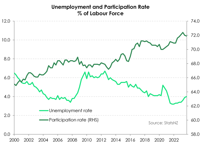
Labour Market Data out today
The labour market has a direct impact on rents, the stronger it is in a region the higher rents rise (see the chart above). Note this is very region specific, the gaps between regional HH Income growth are large, last year Gisborne grew 16% but Northland fell 2%, for major cities, Wellington and Canterbury grew 14% (Otago 15%) while BoP only grew 4% (Auckland 9%)
So today’s Labour Market report provides a hint of NZ growth potential. I cannot see what, if any, the relationship is between jobs and income. Maybe more people in jobs mean mean larger increases in median incomes?


Like one of these posts to record preference: