Rents are rising, as they have nearly always done, only once in my 25 years of property investing did rents fall - for a year. Cash continues to lose value, thats called inflation. Not only are rents rising, but also incomes are rising, in some centres much faster than rents.
However, market forces affecting supply and demand make it an excellent time to buy.
Note: Every chart is updated in future as new data is released, so comments relate to chart data at the time of post publication.
Migration
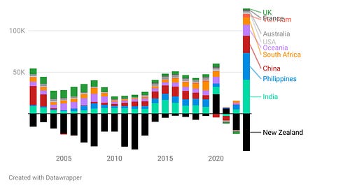
Many articles are being written about the change in Migration. I wondered about the impact so I sought out the data from Stats and was surprised at the numbers;
We have had about 3 years of net migration pre Covid, in just 1 year. Although this is after 2 years of nearly zero migration so it may be a simple catchup. However, the numbers turn expectations of supply and demand of properties on their head. This is almost 100,000 people, say 3 per household that’s 30,000 homes needed now that have not been planned since Covid started. My finding that 2.5% of active bonds are advertised at any time when the market is in equilibrium becomes important here. Almost all regions have less than 2.5% level of supply in December 2023, and nationally it is only 2.1%. Migration at this level will drive prices for investors buying and renters renting to rise faster than normal, irrespective of interest rates or inflation. Supply constraints caused by construction delays may now have a severe impact.
How this shortage looks like by all Regions in NZ;
No region has a surplus, we are simply short of houses, especially rental homes. Both private investors AND Kianga Ora need to build more faster.
Prices
So we are short of properties, how much will this situation impact the market? Are prices up as news media would have us believe? Of course, but is that relevant?
Rents match Household Incomes
Median rents continue to match around 24% of median Household incomes. News organisations have fallen for their own hype, ie, that anecdotal evidence is fair proof of any theory. Rents have always kept a close relationship with household incomes as I have published regularly.
This steady relationship continues today, subject to supply and demand variances which will temporarily move the relationship out of a tight band. The above is my key chart, it gives warnings about the demand/supply equilibrium. Auckland was oversupplied, but has switched suddenly to undersupplied, probably directly from migration impacts. BoP is becoming very undersupplied while Wellington remains oversupplied, BUT the chart has a delay, each year shows the impact since the July year started.
Sales Prices match Household Incomes
I recently discovered that Sales prices also appear to match Household incomes, again subject to a constant supply/demand dynamic. The recent bubble caused by monetary stimulus with excessively low interest rates of course created demand that drove prices to new levels as buyers discovered their interest payments were the same for a $1m home as they had been the year before for a $0.5m home. Unfortunately interest rates have normalised so sales prices have returned to the same relationship as before the bubble. However, incomes have risen 27% from June 2020 to June 2023, so sales prices have too.
Some interesting facets of this chart (note Prices from QV are only available free since 2018):
New Zealand as a whole has no change in the ratio of house prices to Household incomes at 7.7 times in both 2018 and 2023
Auckland sales prices have reduced from 10.5 to 9.6 times income over the last 6 years. Prices have risen due to oversupply, which is now being soaked up with migration, so prices are already back up to 9.7 times income.
Tauranga has low incomes but house prices are rising quickly; maybe Auckland migration. Prices are now similar to Auckland at 9.5 times BoP HH Incomes.
New Zealand as a whole has no change at 7.7 times HH Incomes in both 2018 and 2023
Wellington reduced from 8 to just 6.7 times HH Income because construction in Wellington continued beyond actual demand levels. Wellington has extensive oversupply but migration has started to arrive so I expect prices to rise quickly back to 8. Now is most likely a good time to buy.
I included Lower Hutt to show that outer suburbs can be a good investment option since they still have the same potential for income as the central city, yet prices are a lot lower - at only 5.3 times Wellington HH incomes.
Rents will almost always rise, but how much are they rising in comparison to HH Incomes? The answer is prices are not increasing anymore than any prior period.
Bonus
I also research the economy to help me understand the market behind my investments in the sharemarket - Mainfreight in this case. Waka Kotahi publish data on heavy vehicles passing various points around NZ. Luckily they report a few datapoints regularly that matter. I download this data and plot it to see information, ie the trend. The US publish the same type of data and have completed research that they say terms the data as “transportation as an economic indicator”.
Note, both NZ and USA data sources update all data points when they publish as they get more historic data points, this can change the charts a little - not much.
Includes Auckland north and south, Hamilton - Tauranga and Kaikoura. Wellington data is now erratic.
The reliable US data:
My NZ Truckometer is at record levels so maybe the economy is way better than I would expect from the media. The US on the other hand is only equal to last year but looks likely to be rising to record levels this year.


Thanks as always-- I appreciate the transport data! Very interesting.